Making accessible React Native apps
You will need React Native and Yarn installed on your machine. Some familiarity with React Native will be helpful.
In this tutorial, you’re going to learn how to make React Native apps more accessible. Specifically, we’re going to cover the following:
- What is accessibility?
- Designing apps with accessibility in mind
- Accessibility in React Native apps
- Accessibility testing tools
Of course, we cannot hope to cover everything about accessibility. It’s a pretty big subject and it’s a continuous journey. There’s always something that you can improve in order to make the experience just a little bit more pleasant for a certain user. Instead, what we hope to achieve in this tutorial, is to take that first step into making more accessible apps.
You can view the code used in this tutorial on its GitHub repo. The starter branch contains the not so accessible version of the app, while the a11y branch contains the more accessible version.
Prerequisites
To follow this tutorial, you need to know the basics of creating a React Native app.
The React Native development environment should also be set up on your machine.
We will be using React Native version 0.56 in this tutorial. We’ll also be using Yarn to install packages.
What is accessibility?
Before we proceed, it’s important that we all agree on what accessibility is, in the context of a mobile app. Accessibility or a11y, means making your apps usable to both normal users and users with disabilities. Any person can have one or more form of disability. That usually includes but not limited to the following:
- Visual impairments - examples include low vision, color-blindness, and total blindness.
- Physical or motor disabilities - cerebral palsy, bone and joint deformities.
- Mental disorders - autism spectrum disorders such as Asperger’s syndrome, and autistic disorder.
- Hearing impairment - deafness and partial hearing loss.
- Reading disabilities - Dyslexia.
Accessibility means designing your apps in such a way that it takes all of these disabilities into consideration in order to make the user experience pleasant for everyone.
What you’ll be building
We won’t actually be building anything from scratch. Instead, we’re going to make a pre-built app more accessible. Here’s what the starter app looks like:

This won’t be how the final output will look like because we’ll also be taking design into consideration (though, only a little because I’m not really a designer).
If you want to follow along, clone the repo, switch to the starter branch and install the dependencies:
    git clone https://github.com/anchetaWern/RNa11y.git
    cd RNa11y
    git checkout starter
    yarn install
    react-native upgrade
    react-native link
    react-native run-android
    react-native run-ios
Designing apps with accessibility in mind
In this section, we’ll redesign the app so that it becomes more accessible. We will be using the dos and don’ts on designing for accessibility from the GOV.UK website as a guide. Specifically, we’re going to adopt the following dos from their guide:
- Use simple colors
- Make buttons descriptive
- Build simple and consistent layouts
- Follow a linear, logical layout
- Write descriptive links and heading
- Use good contrasts and a readable font size
- Use a combination of color, shapes, and text
- Make large clickable actions
Right off the bat, you can see that the starter app violates some of these rules. The app is already following a few, but we can still improve on it.
Use simple colors
The starter app violates this rule because it’s using a dark color for its background. It’s not really easy on the eyes, so we need to update the app and card background:
    // file: App.js
    const styles = {
      container: {
        flex: 10,
        backgroundColor: "#FFF" // update this
      }
    };
    // src/components/Card.js
    const styles = StyleSheet.create({
      card: {
        width: 120,
        height: 140,
        backgroundColor: "#3e3e3e", // update this
      }
    });
Also, update the Header component to match. This is because the items in the status bar aren’t really very readable when using a dark background:
    // src/components/Header.js
    const styles = StyleSheet.create({
      header: {
        paddingTop: 10,
        backgroundColor: "#ccc" // update this
      },
      header_text: {
        fontWeight: "bold",
        color: "#333", // update this
      }
    });
Once that’s done, the content should now be more readable.
Make large clickable actions
Next, we need to make the buttons larger. This change is specifically useful for people with physical and motor disabilities, as they’re often the ones who have difficulty in pressing small buttons.
If you inspect the app right now, you’ll see that there’s not much space we can work with. So even if we make the buttons larger, it will still be difficult to target a specific one because there won’t be ample whitespace between them. Though we still have some free space between each card so we’ll make use of that instead.
In your Card component, include the Dimensions module so that we can get the device’s width. We’ll use it to determine how much width each card can use. In this case, we have two cards in each row so we’ll just divide it by two and add a padding. We’re also making the height bigger because we’re anticipating the buttons to become bigger:
    // src/components/Card.js

    import { View, Text, Image, StyleSheet, Dimensions } from "react-native"; // add Dimensions

    const { width } = Dimensions.get("window");

    const cardPadding = 20;
    const styles = StyleSheet.create({
      card: {
        width: (width / 2) - cardPadding, // update this
        height: 150, // update this
      }
    });
Next, we can now proceed with updating the size and padding of the button:
    // src/components/IconButton.js:

    const icon_color = "#586069";
    const icon_size = 25; // update this

    const styles = StyleSheet.create({
      icon: {
        // update these:
        paddingLeft: 10,
        paddingRight: 10
      }
    });
At this point, each button should be huge and visible enough to click on.
Make buttons descriptive
Unfortunately, this isn’t really something that can be implemented all the time because of design constraints. If you check the app now, you’ll see that there’s not really enough space to accommodate labels for each button.
There is a solution, but we will end up giving up the current layout (two cards per row) for a one card per row layout. So the only feasible solution is to have a walkthrough for new users. This way, you can teach what each button is used for. I won’t really be covering how to do that, but there’s a good component which allows you to implement it easily.
Use good contrasts and a readable font size
In my opinion, the app already has pretty good contrast. But to be on the safe side, we’ll tweak it some more.
First, we have to differentiate between each individual card and the app’s background. We can do that by applying a darker background color:
    // src/components/Card.js
    const cardPadding = 20;
    const styles = StyleSheet.create({
      card: {
        width: width / 2 - cardPadding,
        height: 150,
        backgroundColor: "#e0e0e0", // update this
      }
    });
Next, we need to differentiate between the card’s body and its contents:
    // src/components/Card.js
    const styles = StyleSheet.create({
      name: {
        fontSize: 16,
        color: "#3a3f46", // update this
      }
    });
    // src/components/IconButton.js

    const icon_color = "#3a3f46"; // update this
    const icon_size = 25;
Lastly, we need to make the text larger. While there’s no general agreement as to what font size should we be using to optimize accessibility, a few people seem to swear by 16px so we’re also going with that:
    const styles = StyleSheet.create({
      name: {
        fontSize: 16, // update this
      }
    });
We’ve skipped the following because we’re already following them:
- Write descriptive links and heading
- Follow a linear, logical layout
- Use a combination of color, shapes, and text
- Build simple and consistent layouts
Once that’s done, the app’s design should be pretty accessible.
Accessibility in React Native apps
The previous section discussed mainly the visual component of accessibility. In this section, we’ll look at how to make the app more accessible for people who use screen readers.
For those unfamiliar, a screen reader reads to users what they’re currently touching on the screen. This technology is mainly used by blind or visually impaired people. If a screen reader is enabled, the user has to double tap in order to activate the intended action.
In order for a screen reader to be useful, we need to properly label all the relevant components that a user will most likely interact upon. In React Native, this can be done by adding accessibility props. Here’s an example of how we can add these props:
    // src/components/Header.js
    const Header = ({ title }) => {
      return (
        <View
          style={styles.header}
          accessible={true}
          accessibilityLabel={"Main app header"}
          accessibilityRole={"header"}
        >
          <Text style={styles.header_text}>{title}</Text>
        </View>
      );
    };
Let’s go through each of the accessibility props we’ve added to the Header component:
accessible- accepts a boolean value that’s used to mark whether a specific component is an accessible element or not. This means that the screen reader will read whatever label you put on it. Be careful with using this though, as it makes all of its children inaccessible. In theHeadercomponent above, this makes theTextcomponent inside theViewinaccessible. So the screen reader won’t actually read the title indicated in the header. It will only read theaccessibilityLabelyou’ve passed to theViewinstead. It’s a good practice to only set theaccessibleprop totrueif you know that the component doesn’t have any child that’s supposed to be treated as an accessible element.accessibilityLabel- the text you want the screen reader to read when the user touches over it. A good practice when using this prop is to be as descriptive as possible. Remember that the user will only rely on what’s being read by the screen reader. They actually have no idea of the context a specific component is in, so it’s always useful to repeat it in your labels. For example, each of the buttons in each card should still mention the name of the Pokemon.accessibilityRole- the general role of the component in this app. Examples include:button,link,image,text, and in this caseheader. Note thatheaderdoesn’t only indicate the app’s main header. It can also indicate a section header or a list header.
The next component we’ll update is the IconButton because it’s important that the user knows that those buttons we’ve added are actually buttons:
// src/components/IconButton.js
const IconButton = ({ icon, onPress, data, label }) => {
return (
<TouchableOpacity
accessible={true}
accessibilityLabel={label}
accessibilityTraits={"button"}
accessibilityComponentType={"button"}
onPress={() => {
onPress(data.name);
}}
>
<Icon
name={icon}
style={styles.icon}
size={icon_size}
color={icon_color}
/>
</TouchableOpacity>
);
};
```
From the code above, you can see that we’re accepting a new `label` prop which we then use as the value for the `accessibilityLabel`. We’ve also set the component to be `accessible` which means that when the user’s finger goes over it, the screen reader will read out the `accessibilityLabel`.
But what about `accessibilityTraits` and `accessibilityComponentType`? Well, they are the old way of setting the `accessibilityRole`. `accessibilityTraits` is only for iOS and `accessibilityComponentType` is only for Android. As [mentioned in the docs](https://facebook.github.io/react-native/docs/accessibility#accessibilitytraits-ios), these props will be deprecated soon. We’re only using it because `TouchableOpacity` doesn’t seem to be accepting `accessibilityRole`. The trait (button) wouldn’t show up as I was testing with the accessibility inspector. We’ll go over this tool in the next section.
Lastly, we update the `Card` component so it passes the correct labels to each of the IconButton. We’re also making the Pokemon Image and Text accessible:
``` javascript
// src/components/Card.js
const Card = ({ item, viewAction, bookmarkAction, shareAction }) => {
return (
<View style={styles.card}>
<Image
source={item.pic}
style={styles.thumbnail}
accessible={true}
accessibilityRole={"image"}
accessibilityLabel={`${item.name} image`}
/>
<Text style={styles.name} accessibilityRole={"text"}>
{item.name}
</Text>
<View style={styles.icons}>
<IconButton
icon="search"
onPress={viewAction}
data={item}
label={`View Pokemon ${item.name}`}
/>
<IconButton
icon="bookmark"
onPress={bookmarkAction}
data={item}
label={`Bookmark Pokemon ${item.name}`}
/>
<IconButton
icon="share"
onPress={shareAction}
data={item}
label={`Share Pokemon ${item.name}`}
/>
</View>
</View>
);
};
```
In case you’re wondering why we didn’t add the `accessible` and `accessibilityLabel` prop in the Pokemon label, it’s because the `Text` component is [accessible by default](https://facebook.github.io/react-native/docs/text#accessible). This also means that the screen reader automatically reads the text inside of this component.
## Accessibility testing tools
In this section, we’ll take a look at four tools you can use to test the accessibility of your React Native app.
### Testing accessibility while developing the app
In iOS, you can use the Accessibility Inspector tool in Xcode. Because it’s in Xcode, you have to run the app from Xcode. You can do that by opening the `RNa11y.xcodeproj` or `RNa11y.xcworkspace` file inside your project’s `ios` directory. Then run the app using the big play button located on the upper left side of the screen.
Once the app is running, you can open the Accessibility Inspector tool by going to **Xcode** → **Open Developer Tool** → **Accessibility Inspector**.
From there, you can select the running iOS simulator instance:
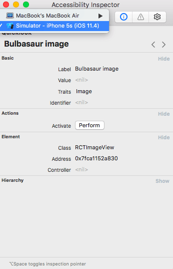
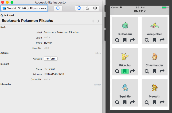
Once you’ve selected the simulator, click on the target icon right beside the drop-down. This activates the inspection mode. You can then hover over the components which we updated earlier and verify whether the inspector is reading the labels correctly:
For Android testing, you can use the [Accessibility Scanner](https://play.google.com/store/apps/details?id=com.google.android.apps.accessibility.auditor) app. Unlike the Accessibility Inspector in iOS, you have to install it on your emulator or device in order to use it. Once installed, go to **Settings** → **Accessibility** → **Accessibility Scanner** and enable it.
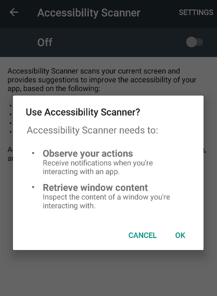
Once it’s enabled, switch to the app that we’re working on and click the floating blue button. This will scan the app for any accessibility issues. Once it’s done scanning, you can click on any of the indicated areas to view the suggestion:
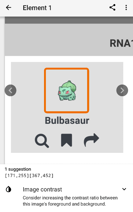
The easiest way to solve this issue is by making the card’s background color lighter. You can also try increasing the contrast of the image as suggested.
Interestingly, if you remove the accessibility props from the image and scan again, you’ll see that it will no longer complain about the contrast:
``` javascript
// src/components/Card.js
const Card = ({ item, viewAction, bookmarkAction, shareAction }) => {
return (
<View style={styles.card}>
<Image
source={item.pic}
style={styles.thumbnail}
/>
...
</View>
);
};
```
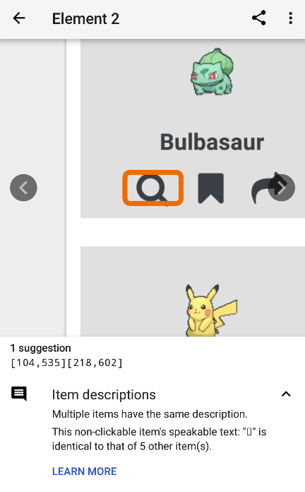
This can mean that the scanner only gets picky when you’ve marked a component as accessible. To test this assumption, try removing the accessibility props from the IconButton:
``` javascript
// src/components/IconButton.js
const IconButton = ({ icon, onPress, data, label }) => {
return (
<TouchableOpacity
onPress={() => {
onPress(data.name);
}}
>
...
</TouchableOpacity>
);
};
```
If you run the scanner again, you’ll see that it actually picks up on the issue:
### Manual accessibility testing
As with anything, it’s always important to test things manually so you know the actual experience your users are getting. After all, accessibility is all about improving the user experience that your users get when using the app.
#### Testing in iOS
To test things manually in iOS, open Xcode and run the app on your iOS device. You can also do this from the simulator but that kinda beats the purpose of manual testing. You won’t really have an accurate “feel” of the experience if you’re just testing from a screen.
Once the app is running on your device, go to **Settings** → **Accessibility** → **VoiceOver**. From there, you can select the **Speech** menu to change the voice (I personally prefer Siri Female). You can also adjust the speaking rate. Adjust a little bit more from the mid-point should be fast enough for most people.
Once you’re done adjusting the settings, enable the **VoiceOver** setting then switch to the app. From there, you can tap on each of the accessibility areas that we’ve set to verify if it’s being read correctly.
#### Testing in Android
To test in Android, run the app on your Android device. Once the app is running, go to **Settings** → **Language** and set it to your preferred language.
Next, go to **Accessibility** → **Text-to-speech** options and make sure the **Default language status** is fully supported. If not, you have to go to the language settings again and select a supported language.
The equivalent of VoiceOver in Android is TalkBack, you can enable it by going to **Accessibility** → **TalkBack** then enable the setting**.** Once enabled, switch to the app and verify if the labels are read correctly as you tap.
## Further reading
Here are some resources to learn more about accessibility:
- [Accessibility by Rob Dodson](https://www.youtube.com/watch?v=KPN31sB7v8c)
- [React Native Accessibility: Creating Inclusive Apps in React Native](https://medium.com/@larenelg/creating-inclusive-apps-in-react-native-the-coding-bit-bd3832349009)
- [React Native: Accessibility](https://facebook.github.io/react-native/docs/accessibility)
- [Accessibility Testing on Android](https://robots.thoughtbot.com/accessibility-testing-on-android)
- [iOS Accessibility Tutorial: Getting Started](https://www.raywenderlich.com/845-ios-accessibility-tutorial-getting-started)
## Conclusion
That’s it! In this tutorial, you’ve learned how to make React Native apps more accessible to a person with disabilities. I hope that you’ll use the knowledge you’ve gained in order to make accessibility a part of your development workflow. Because all of your users deserve an equal or similar ease of use.
You can view the code used in this tutorial on its [GitHub repo](https://github.com/anchetaWern/RNa11y).13 August 2018
by Wern Ancheta